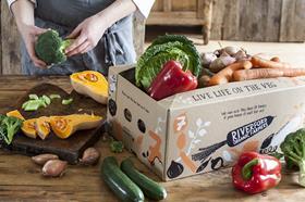
Riverford has unveiled a new look designed to show the world that it is 'mad about – and experts in – veg'.
The veg box firm's rebranded look is comprised of vibrant veg paintings and illustrations, and a distinctive black carrot.
Riverford's brand and customer director Rachel Watson, said:“If someone’s looking for veg, we want them to think, ‘Riverford’. We want to put our authority about veg back at the heart of the business, and think this new look and refocusing on veg will help us reach like-minded people.'
Brand and communications manager Vitha Powell added: “It’s a distinctive, memorable carrot shape that helps us communicate who we are and what we do. We have also changed our name very slightly from Riverford Organic Farms to Riverford Organic Farmers, to celebrate the fact that we are an independent, personal business, and farmers at heart.”
The brand team worked with London design agency Big Fish, with an 'in-depth' 18-month process Riverford claims was aimed at helping centre the company’s thinking on veg, and also to help decide on the new look and feel of the business.
To reinforce their position as veg 'obsessives', Riverford is using the slogan 'Live Life on the Veg'. Powell added: “It’s an ethic to live by. Veg is our favourite topic, it’s what excites us and it’s always been at the heart of everything we do. We are committed to encouraging people to choose good quality, organic, grass fed meat and dairy too, but veg will always be central to everything we do.'