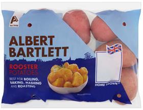
Albert Bartlett has unveiled a new look for its potato packs in an effort to help the brand stand out more on shop fixtures, and to better communicate brand values.
The redesign has been rolled out across the full Albert Bartlett range, including its well-known Rooster potato variety.
The packs sport a more prominent bold logo, and retain the brand’s existing colours to try and ensure that shoppers still recognise the distinctive blue Albert Bartlett Rooster packaging.
Albert Bartlett launched a range of frozen products earlier this month, and its design mirrors that of the fresh parent brand. The fresh and frozen packaging for Albert Bartlett was designed by Windsor-based agency, Tynan D’Arcy.
Michael Jarvis, head of marketing at Albert Bartlett, said: “Albert Bartlett is the leading branded potato on the market and we wanted to underline what makes us different – our research told us that shoppers love that our potatoes are British and that we have enjoyed strong relationships with our farmers throughout the company’s long family heritage.
'The new design emphasizes both our British origins and our rural heritage – the name of the farmer who grew the potatoes is a key feature on every bag, which we are now emphasizing more strongly than before.
'Not all potatoes are equal, so we’ve also included a clear area on the front of pack to allow shoppers to see what they are buying more easily.
'We are delighted with the new-look packs and are confident that they will help the Albert Bartlett brand to build on its leadership.”