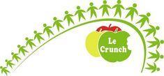
French apple producers have given their Le Crunch brand a makeover with the launch of a new logo.
The French Apples Marketing Commission has created the logo to be used across all marketing activities in Europe and the rest of the world.
The re-branded logo features a new typeface and design showing children holding hands. It is aimed at representing the values of the Le Crunch brand and its relationship to children worldwide.
Jacques Vanoye, president of the commission, said: “We wanted to show that Le Crunch is a child-friendly brand. Fruit and vegetable producers across Europe are fighting back to reduce obesity, in particular where children are concerned.
“We are encouraging children to eat healthily and to exercise more through our primary school programme in the UK and in all our promotional activities, and this is what the new logo represents - our determination to get children to think of apples as fun.”