French interprofessional organisation Interfel has unveiled both a new visual identity and a plan for future communication campaigns centred around three axes: jobs, children and the Common Agricultural Policy, Fld reported.
Bernard Piton, president of Intefel's communication commission, commented: 'For two years, we have been considering a change of direction to Interfel's strategic communication to make fruit and vegetables fresher, more authentic and more in line with the jobs in our sector.'
Having concentrated for a long time on the idea of health and diet, Interfel has decided to put people back at the heart of its message.
'In the collective imagination, fruit and vegetables produce themselves,' said Interfel's Valérie Sené. 'In fact, a whole chain of actors is involved in creating the product's final value.'
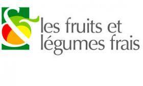
It is the importance of this mass of different people to the sector that inspired Interfel's new logo, with its inclusive ampersand sign.
In addition, Interfel has identified a new type of consumer, the Conso'battant, who makes purchasing decisions based on severe budgetary constraints, and therefore consumes less but better produce.
Children have also been singled out, with Interfel teaming up with Italian association Alimos to target the 6-11 age group, with a focus on kiwifruit and strawberries.