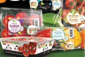
Red Sun Farms, a vertically integrated greenhouse grower with locations in North America and Mexico, has unveiled a new corporate logo.
Customer demand for more visible branding in the retail environment was a key motivation behind the refresh.
“The new logo incorporates the iconic butterfly while maintaining bright, bold colours that honour the history of the brand, ensuring continuity and consistency,” Red Sun Farms said in a media release. “Its modern refresh reflects growth and innovation that reenforces a positive and progressive brand identity.”
Red Sun Farms recently unveiled a graphic refresh for its pre-packs, with the designs promoting greater visibility of its range of tomatoes, peppers and cucumbers.
The company took its lead from market research, retailer feedback and consumer inquiries in order to improve the customer connection to its brand in the US and Canadian markets.
“As the brand continues to grow in both retail and trade events, it was clear that we also needed to evolve our logo to better represents who we are today, while encompassing the possibilities of where we will grow our business tomorrow,” said Carlos Visconti, chief executive of Red Sun Farms Canada and USA. “We continue to invest in our future and our brand to better support our customers.”


