Multinational advertising agency BBDO’s Santiago office was recently commissioned to create a new identity for the Chilean fruit industry and its various sub-sectors.
Under the brand ‘Fruits from Chile – the pride of our land’, the industry will communicate key messages emanating from extensive global research that found stakeholders value the people who cultivate the land as integral to the success of Chile as an exporter.
Ronald Bown, chairman of the board of the Chilean Exporters Association (Asoex), says that transforming this factor into a point of reference for the international market would allow the country to differentiate its fruit industry in a way that none of its competitors had been able to previously. Chile possesses a large group of people to whom the fruit industry is second nature, and who have been trained to become reliable, professional, resilient and committed to upholding industry standards.
“What we are talking about here is fruit from Chile, cultivated by dedicated hands, in the southernmost tip of the American continent along the Pacific coast, with privileged geographical and climatic conditions, which guarantees a quality and delicious product that represents the best of Chile and the spirit of its people,” says Bown.
“It is our workforce that sets Chile apart and has enabled our industry to assume leadership of the Southern Hemisphere export industry,” he continues. “They have developed a reputation based on total dedication to the industry and a special relationship with the land.
“Our connection with the land produces a different outlook on fruit growing and a deeper understanding of relationships between fruit and its environment over the course of many years. This is the pillar on which the Chilean fruit industry is based.”
The strength of the workforce is underpinned by nine key messages backing the work behind the branding strategy: leadership, country image, consistency, innovation, working together, knowledge of markets, communication with the end consumer, professionalism and, last but not least, quality.
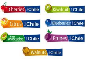
“Prior to the launch of this new identity for all Chilean fruit, the sector had a fragmented branding strategy that lacked direction,” explains Felix de Vicente, director of ProChile. “The industry had been working under the overarching Chile Fresh Fruit logo, which has become well recognised around the world. However, it was felt that the plethora of detached logos that had been introduced in that period to represent a number of our key sub-sectors have given Chilean fruit a range of identities that could prove confusing.
“The private sector, supported by the public sector, decided the time had arrived to create a consistent and harmonised branding strategy for Chilean fruit and its related sectors, which would reflect the image and values conveyed by the branding,” he adds. “By giving a clear vision of what Chilean fruit stands for, we hope to achieve greater penetration and development of export potential in the next few years.”