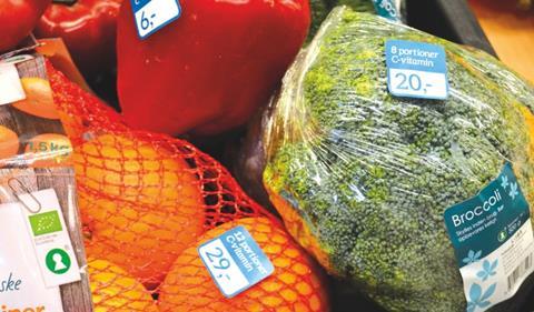
What can supermarkets do to convey the potential health benefits of eating fresh produce? Danish designer Janni Svane recently completed an MA project in which she proposed an interesting new method of retail in-store communication that placed far greater emphasis on the nutritional attributes of fresh fruit and vegetables.

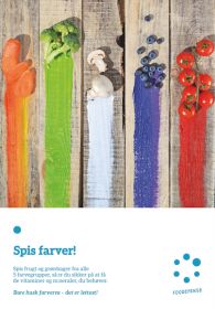
In a market where consumers’ lack of time and their concerns over price tend to inform purchasing decisions more than other factors, Svane says she saw an opportunity to improve the way information about nutritional content was communicated to shoppers. By doing so, she wanted to prove that the way those shoppers interpret price could be altered and improved, based on a greater understanding of what each product actually contained. In addition, she took the concept of five colour groups as a guide to eating the right balance of vitamins and minerals and applied it to her new communication strategy.
Here, Svane talks about the project and explains the different elements she wanted to introduce in order to make healthy eating a more straightforward proposition for consumers.
Can you tell me a little bit about what you set out to achieve with the project?
Janni Svane: My MA project deals with a rethinking of the concept of supermarkets, in particular Danish ones, to become better at communicating healthier aspects of produce, with a more user-centered approach. The idea is to make invisible aspects of food, like vitamins, more visual for the consumer during their grocery shopping. Adding the information to the price tags and shelf labels can help people get a new and better understanding of health in relation to food, right at the most important touchpoint.
The concept also deals with our perception of price, which is just our own interpretation or priority. What is expensive and what is cheap? This could depend on what you believe you are paying for: is 500g of broccoli your daily vitamin C intake or is it 100ml of water content? By leading the price focus away from the physical amount of a product towards inner aspects such as vitamins, you get a totally new and more healthy understanding while you’re deciding to buy the product or not. Just as you do when visualising the difference between organic and conventional groceries.

What information did you include on the shelf labels?
JS: The shelf labels added information to the price, which was already stated. For example, the concept added percentage of water content and what the price of water would be when buying the product. The concept also added how much the whole daily intake of a specific vitamin would cost when buying the product. And I also added colour tags to different types of vegetables and fruit to let people understand that all vegetables and fruit can be divided into five colours. When eating portions of all five colours daily, you get a visual understanding that you are getting the vitamins you need.
What kind of response have you had to the idea?
JS: The concept has been very well received by visitors at my MA exhibition, with a great understanding of how important this is for learning about health. From educating people in school about health, the supermarkets could also take great responsibility for their customers in this way. The project also created some awareness in a Danish design magazine, mainly because of its focus on design in everyday life. The design is more than just objects, its very much about conceptual, visual thinking.


